
Flutter版本的海外剧
发表于|更新于
|浏览量:
背景
前阵子抓包,有两个海外剧的接口,最近有时间,打算温习一下 Flutter,就用来写了一个简单的 APP,包含轮播图、下拉刷新、上拉加载以及播放功能。
效果如下:
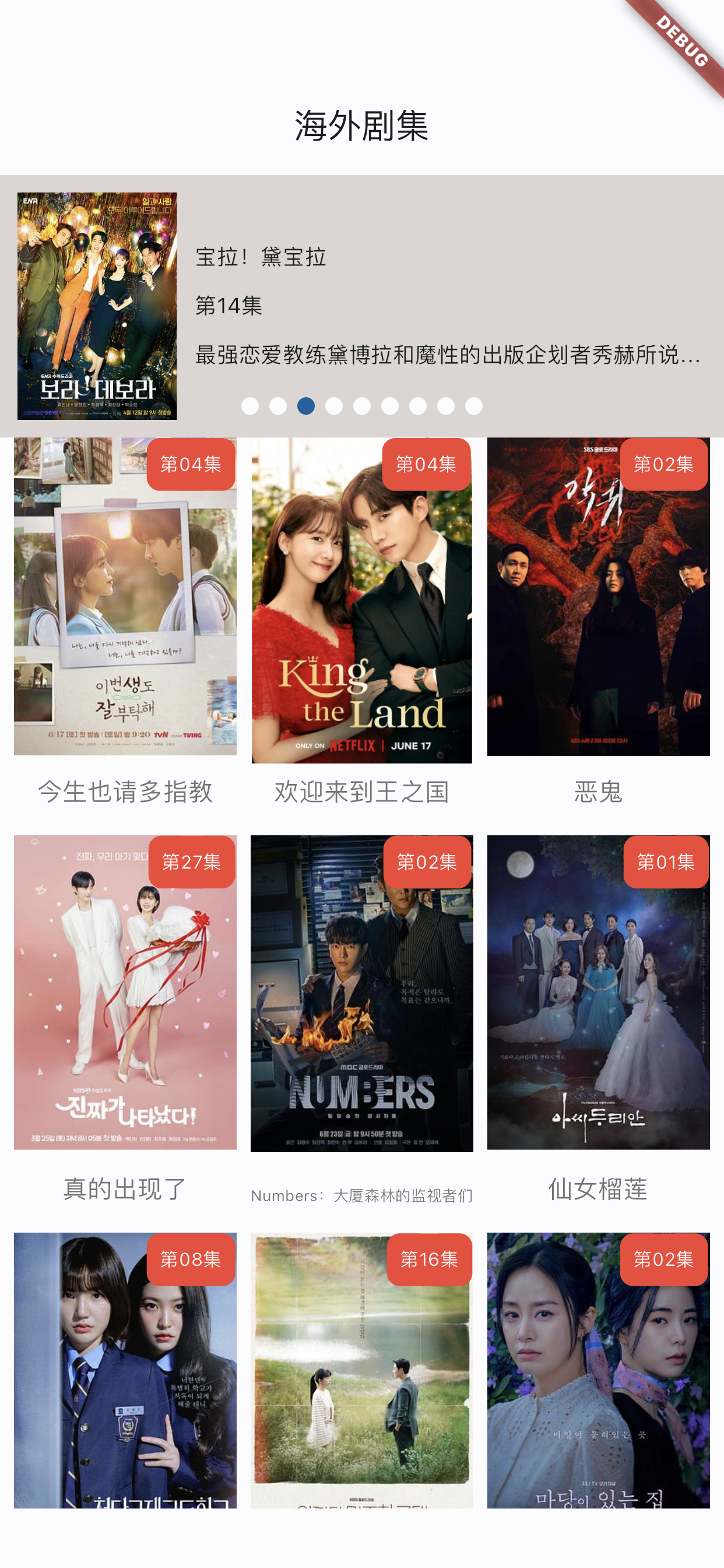
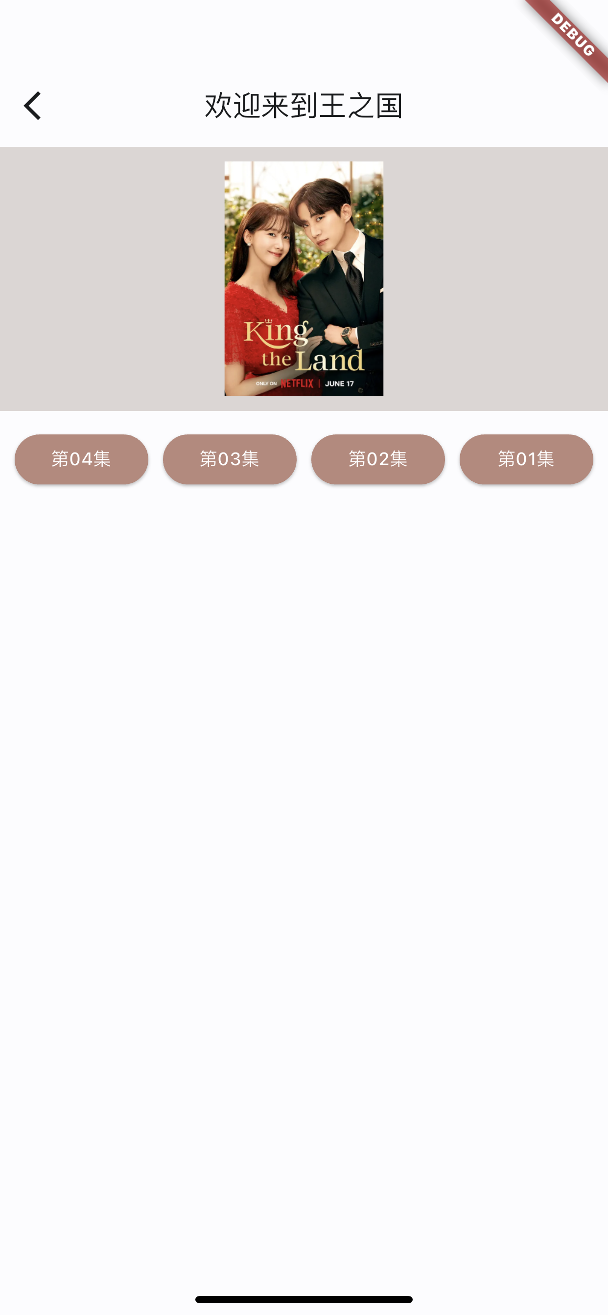
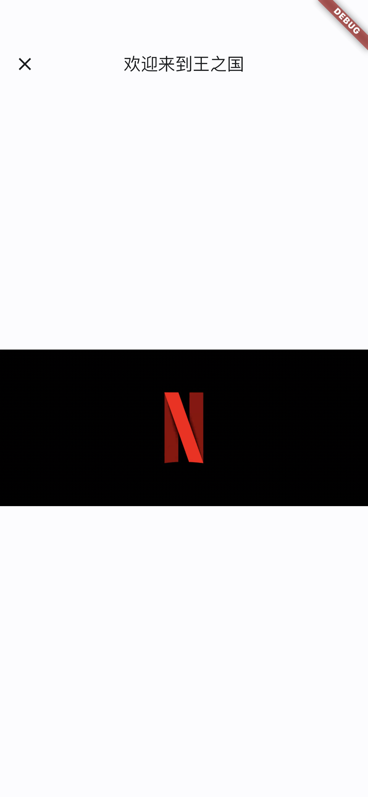
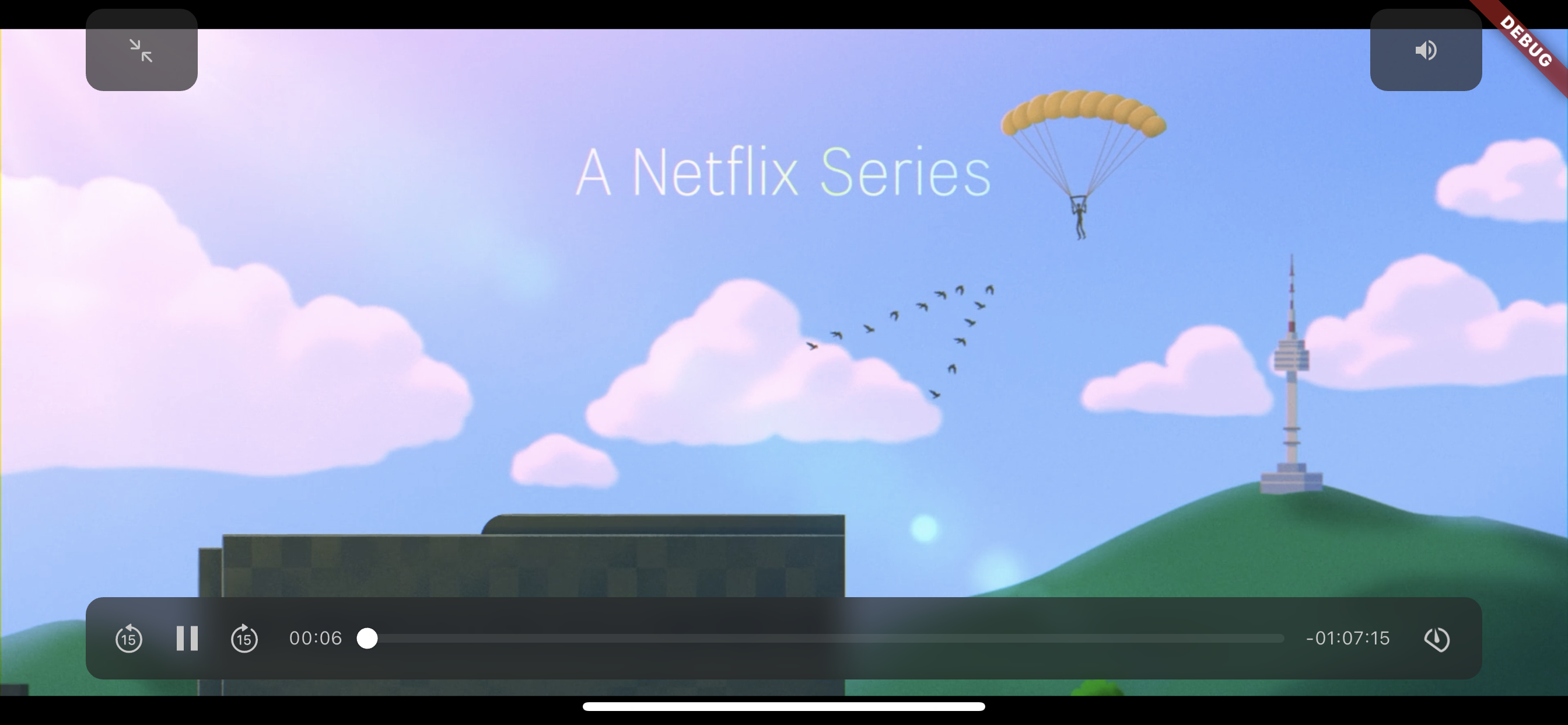
运行时需要注意 Flutter 版本的问题,可能需要修改 播放器的 package 中的代码,直接Google 搜索,修改即可,如有疑问可以联系我。
代码放在 Github 上,地址是:meiju_flutter
文章作者: 今是昨非
版权声明: 本博客所有文章除特别声明外,均采用 CC BY-NC-SA 4.0 许可协议。转载请注明来源 今是昨非的博客!
相关推荐
2021-07-22
Flutter组件基础——ListView
Flutter组件基础——ListViewListView是滚动列表,类似于iOS中ScrollView,可横向、纵向滚动,内容不限。 ListView的使用ListView的使用很简单,但是需要多多练习; ListView的使用,通过设置children来实现,children中的Item为Widget对象。 纵向滚动代码如下: 123456789101112131415161718192021222324252627282930313233343536373839class MyApp extends StatelessWidget { @override Widget build(BuildContext context) { return MaterialApp( title: 'ListView Learn', home: Scaffold( appBar: new AppBar( tit...
2021-07-19
Flutter组件基础——Text
Flutter组件基础——Text组件文本组件:Text WidgetText是文本组件,类似于iOS中UILabel,用于文本的展示,是布局的基础控件之一。 文本对齐方式:TextAlign TextAlign center:Align the text in the center of the cotainer left:Align the text on the left edge of the container right:Align the text on the right edge of the container start:Align the text on the leading edge of the container. For left-to-right text(TextDirection.ltr), this is the left edge. For the right-to-left text(TextDirection.rtl), this is the right edge. end:Align the text on the trai...
2021-07-27
Flutter组件基础——Button
Flutter组件基础——ButtonFlutter中常用的Button有ElevatedButton、TextButton、OutlinedButton,之前可能还有RaisedButton、FlatButton、OutlineButton,但是已被废弃,参考RaisedButton vs ElevatedButton, FlatButton vs TextButton and OutlineButton vs OutlinedButton TextButtonTextButton可简单理解为按钮,即可点击的Text。 常用属性如下: TextButton常用属性: autofocus child clipBehavior enabled focusNode onLongPress onPressed style 来看一下,定义三个按钮,分别对应,按钮不可点击,按钮可点击,按钮带有渐变背景,三种情况,效果如下: 使用代码如下: 123456789101112131415161718192021222324252627282930313233343536373839...
2021-07-23
Flutter组件基础——GridView
Flutter组件基础——GridViewGridView是网格布局,类似于iOS中的UICollectionView,可设置每行多少个、单个对象的宽高比、对象水平方向的间距、垂直方向的间距等等。 GridView的常用属性 GridView scrollDirection: 滑动方向 Axis.horizontal: 水平方向滑动 Axis.vertical: 垂直方向滑动,默认为这个。 padding: GridView相对于父视图的边距 crossAxisCount: 每行多少个 mainAxisSpacing: 与滑动方向垂直的方向的间距,eg: 当横向滑动时,这个代表垂直方向对象之间的间距; crossAxisSpacing: 与滑动方向平行的方向的间距,eg: 当横向滑动时,这个代表水平方向对象之间的间距; childAspectRatio:单个元素的宽高比(或者高宽比),当scrollDirection为vertical时,代表宽高比;当scrollDirection为horizontal时,代表高宽比。 简单使用代码如下: 1234567891011...
2022-09-23
Flutter组件——Tabbar
[Flutter组件——Tabbar]使用Tabar使用,设置indicator的样式,长短,设置tab选中和未选中的样式,根据数组创建Tabbar。 代码如下: 1234567891011121314151617181920212223242526272829303132333435363738394041424344454647484950515253545556575859606162636465666768697071727374757677import 'package:flutter/material.dart';class TabbarDemo extends StatefulWidget { TabbarDemo({Key? key}) : super(key: key); _TabbarDemoState createState() => _TabbarDemoState();}class _TabbarDemoState extends State<TabbarDemo> ...
2021-08-18
Flutter布局基础——BottomNavigationBar
Flutter布局基础——BottomNavigationBar背景Flutter中BottomNavigationBar类似于 iOS 中的UITabbarController,是导航控制器的一种,常用于首页 Tab 切换。 BottomNavigationBar的 type 属性,默认值会根据items的个数而定;当items个数小于4个时,默认值为BottomNavigationBarType.fixed;当items个数大于等于4个,默认值为BottomNavigationBarType.shifting。 两种效果对比如下:左侧为BottomNavigationBarType.fixed,右侧为BottomNavigationBarType.shifting 常用属性如下: backgroundColor: 背景色 currentIndex: 当前选中哪一个 fixedColor: 选中 Item 的颜色 iconSize: 图片大小 items: 子元素 onTap: 点击事件 selectedFontSize: 选中字体大小 select...