Card,卡片式布局,带有一点圆角和阴影。通常用于关联信息的展示,比如:相册信息、经纬度、联系人信息等等。
Card的使用
来看一下,如何做一个,常见的列表元素的控件,左侧是个Icon,上面是title,然后是desc,最下面是按钮,常见于订单列表。
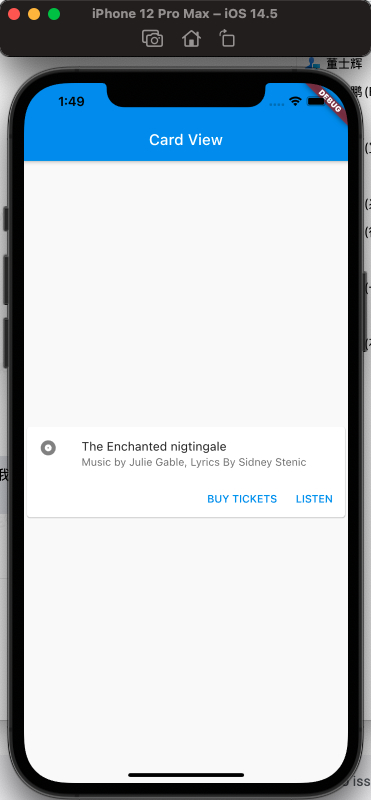
要实现的效果如下:
然后看如何实现:
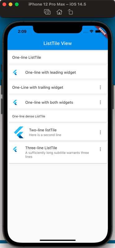
这里需要介绍一下ListTile,Flutter提供的固定高度的,左侧或右侧带有Icon以及文案的控件。
可实现效果如下:
代码如下:
1
2
3
4
5
6
7
8
9
10
11
12
13
14
15
16
17
18
19
20
21
22
23
24
25
26
27
28
29
30
31
32
33
34
35
36
37
38
39
40
41
42
43
44
45
46
47
48
49
50
51
52
53
54
55
56
57
58
59
60
61
62
63
64
65
66
67
68
|
class MyApp extends StatelessWidget {
  @override
  Widget build(BuildContext context) {
    return MaterialApp(
      home: Scaffold(
        appBar: new AppBar(
          title: new Text('ListTile View'),
        ),
        body: ListView(
          children: [
            Card(
              child: ListTile(
                title: Text('One-line ListTile'),
              ),
            ),
            Card(
              child: ListTile(
                leading: FlutterLogo(),
                title: Text('One-line with leading widget'),
              ),
            ),
            Card(
              child: ListTile(
                title: Text('One-Line with trailing widget'),
                trailing: Icon(Icons.more_vert),
              ),
            ),
            Card(
              child: ListTile(
                leading: FlutterLogo(),
                title: Text('One-line with both widgets'),
                trailing: Icon(Icons.more_vert),
              ),
            ),
            Card(
              child: ListTile(
                title: Text('One-line dense ListTile'),
                dense: true,
              ),
            ),
            Card(
              child: ListTile(
                leading: FlutterLogo(
                  size: 56.0,
                ),
                title: Text('Two-line listTile'),
                subtitle: Text('Here is a second line'),
                trailing: Icon(Icons.more_vert),
              ),
            ),
            Card(
              child: ListTile(
                leading: FlutterLogo(),
                title: Text('Three-line ListTile'),
                subtitle:
                    Text('A sufficiently long subtitle warrants three lines'),
                trailing: Icon(Icons.more_vert),
                isThreeLine: true,
              ),
            )
          ],
        ),
      ),
    );
  }
}
|
上面的代码介绍了ListTile的使用,已经覆盖很全面。
然后再来看最初想要实现的效果,分割成已知的基础控件如下:
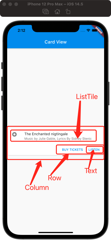
Icon加右侧的title和desc可以使用上面介绍的ListTile,下面单个按钮可以使用TextButton(额,还没介绍,稍等补上一篇,目前可以用Text),两个按钮水平布局可以使用Row,ListTile和Row的上下布局可以使用Column,然后最外层再用Card,卡片对象包括起来,所以最终代码如下:
1
2
3
4
5
6
7
8
9
10
11
12
13
14
15
16
17
18
19
20
21
22
23
24
25
26
27
28
29
30
31
32
33
34
35
36
37
38
39
40
41
42
43
44
45
46
47
48
49
50
|
class MyApp extends StatelessWidget {
  const MyApp({Key? key}) : super(key: key);

  static const String _title = 'Card View';

  @override
  Widget build(BuildContext context) {
    return MaterialApp(
        title: 'Card View',
        home: Scaffold(
          appBar: new AppBar(title: new Text(_title)),
          body: const MyStatelessWidget(),
        ));
  }
}

class MyStatelessWidget extends StatelessWidget {
  const MyStatelessWidget({Key? key}) : super(key: key);

  @override
  Widget build(BuildContext context) {
    return Center(
      child: Card(
        child: Column(
          children: [
            const ListTile(
              leading: Icon(Icons.album),
              title: Text('The Enchanted nigtingale'),
              subtitle: Text('Music by Julie Gable, Lyrics By Sidney Stenic'),
            ),
            Row(
              mainAxisAlignment: MainAxisAlignment.end,
              children: [
                TextButton(onPressed: () {}, child: Text('BUY TICKETS')),
                SizedBox(
                  width: 8,
                ),
                TextButton(onPressed: () {}, child: const Text('LISTEN')),
                SizedBox(width: 8),
              ],
            )
          ],
          mainAxisSize: MainAxisSize.min,
        ),
      ),
    );
  }
}
|
最终效果就为上面的效果了,要注意Card的使用,通常是结合Column或Row等其他集合类的组件来实现的。
参考
Card Dev Doc
ListTile Dev Doc
Flutter免费视频第三季-布局