层叠布局适用于子视图叠放一起,且位置能够相对于父视图边界确认的情况。
比如,可用于图片上加文字,按钮上加渐变阴影等等。
Stack Widget的子视图要么是positioned,要么是non-positioned。Positioned子视图是指使用Positioned的widget包括起来的子视图,通过设置相对于Stack的top、bottom、left、right属性来确认自身位置,其中至少要有一个不为空。
Stack Widget的大小取决于所有non-positioned的子视图。non-positioned的子视图的位置根据alignment属性确定,(当alignment为left-to-right时,子视图默认从左上角开始;当aligment为right-to-left时,子视图从右上角开始;)。
Stack 基础使用
Stack常用属性
- Stack常用属性
- children:子视图
- alignment:子视图的对齐方式
- topLeft:顶部左对齐
- topCenter:顶部居中对齐
- topRight:顶部右对齐
- centerLeft:中间左对齐
- center:中间对齐
- centerRight:中间右对齐
- bottomLeft:底部左对齐
- bottomCenter:底部居中对齐
- bottomRight:底部右对齐
- clipBehavior,裁剪,可能会影响性能
- Clip.hardEdge: Stack默认为此选项
- Clip.antiAlias: 平滑裁剪
- Clip.antiAliasWithSaveLayer
- Clip.none: 不需要裁剪
- fit:子视图填充方式
- StackFit.loose: 使用子组件的大小
- StackFit.expand: 充满父视图的区域
- StackFit.passthrough: 透传,使用Stack的父视图的布局方式
- textDirection
- TextDirection.ltr
- TextDirection.rtl
Positioned常用属性如下:
- Positioned常用属性
- child
- height
- width
- bottom
- left
- right
- top
alignment对齐
使用代码如下:
1
2
3
4
5
6
7
8
9
10
11
12
13
14
15
16
17
18
19
20
21
22
23
24
25
26
27
28
29
30
31
32
33
34
35
36
37
38
|
class MyApp extends StatelessWidget {
  @override
  Widget build(BuildContext context) {
    var stack = new Stack(
      alignment: Alignment.bottomRight,
      children: [
        new Container(
          width: 300.0,
          height: 300.0,
          color: Colors.orange,
        ),
        new Container(
          width: 200.0,
          height: 200.0,
          color: Colors.green,
        ),
        new Text(
          'alignment bottomRight',
          style: TextStyle(color: Colors.white, fontSize: 21),
        )
      ],
    );

    return MaterialApp(
      title: 'StackView Widget',
      home: Scaffold(
        appBar: new AppBar(
          title: new Text('StackView Widget'),
        ),
        body: Center(
          child: stack,
        ),
      ),
    );
  }
}
|
效果如下:
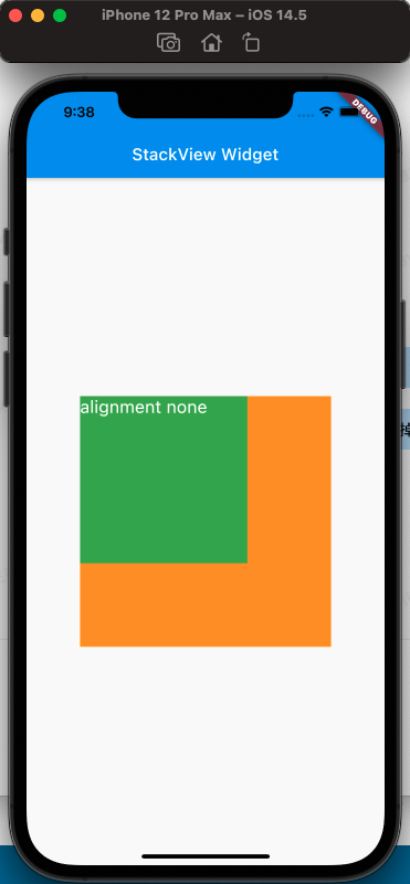
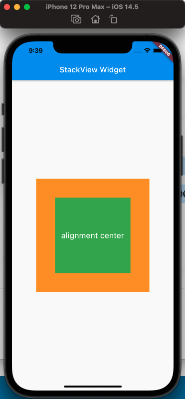
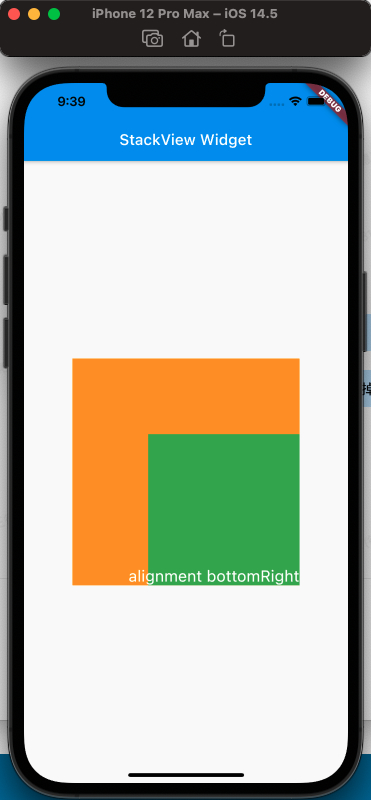
从上面的对比,可以看出alignment的属性,对设置Stack的子视图的效果
clipBehavior属性
为了方便查看clipBehavior的效果,需要写一个相对于Stack超出的子视图,使用Postitioned Widget,设置top、left为负值即可。
代码如下:
1
2
3
4
5
6
7
8
9
10
11
12
13
14
15
16
17
18
19
20
21
22
23
24
25
26
27
28
29
30
31
32
33
34
35
36
37
38
39
40
41
|
class MyApp extends StatelessWidget {
  @override
  Widget build(BuildContext context) {
    var stack = new Stack(
      clipBehavior: Clip.antiAliasWithSaveLayer,
      children: [
        new Container(
          width: 300.0,
          height: 300.0,
          color: Colors.orange,
        ),
        Positioned(
            child: new Container(
              width: 200.0,
              height: 200.0,
              color: Colors.green,
            ),
            left: -20,
            top: -20),
        new Text(
          'clip antiAliasWithSaveLayer',
          style: TextStyle(color: Colors.white, fontSize: 21),
        ),
      ],
    );

    return MaterialApp(
      title: 'StackView Widget',
      home: Scaffold(
        appBar: new AppBar(
          title: new Text('StackView Widget'),
        ),
        body: Center(
          child: stack,
        ),
      ),
    );
  }
}
|
效果如下:
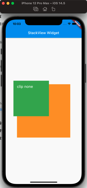
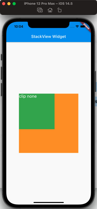
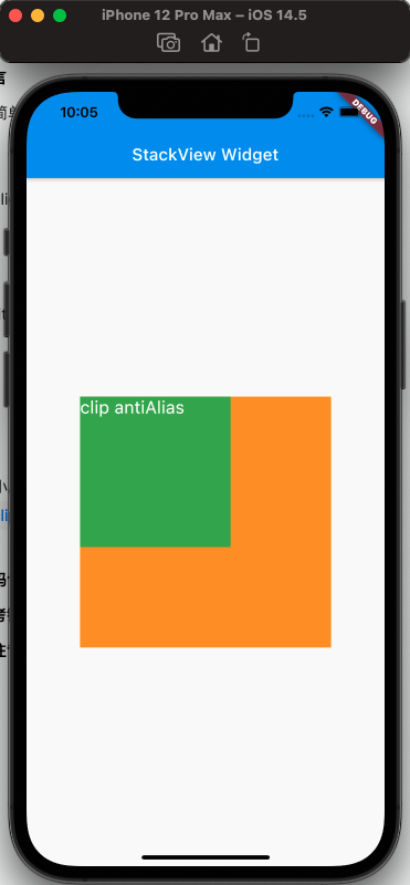
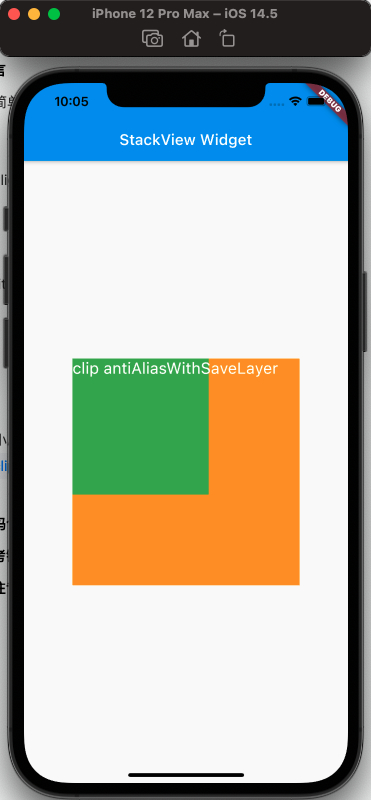
从上面可以看出clipBehavior的效果
fit属性
fit填充方式,fit的expand和loose属性很容易区分,但是loose和passthrough属性的区别需要特别注意。为了容易区分出来不同,这里使用Row作为的父视图Stack。
简单的理解,expand是充满父视图;loose是按照子视图的大小来;passthrough则是按照父视图的父视图的约束来。
使用代码如下:
1
2
3
4
5
6
7
8
9
10
11
12
13
14
15
16
17
18
19
20
21
22
23
24
25
26
27
28
29
30
31
32
33
34
35
36
37
38
39
40
41
42
|
class MyApp extends StatelessWidget {
@override
Widget build(BuildContext context) {
var stack = new Stack(
fit: StackFit.passthrough,
children: [
new Container(
width: 300.0,
height: 300.0,
color: Colors.orange,
),
new Container(
width: 200.0,
height: 200.0,
color: Colors.green,
),
new Text(
'StackFit passthrough',
style: TextStyle(color: Colors.white, fontSize: 21),
),
],
);
return MaterialApp(
title: 'StackView Widget',
home: Scaffold(
appBar: new AppBar(
title: new Text('StackView Widget'),
),
body: Center(
child: Row(
children: [Expanded(child: stack)],
),
),
),
);
}
}
|
效果如下:
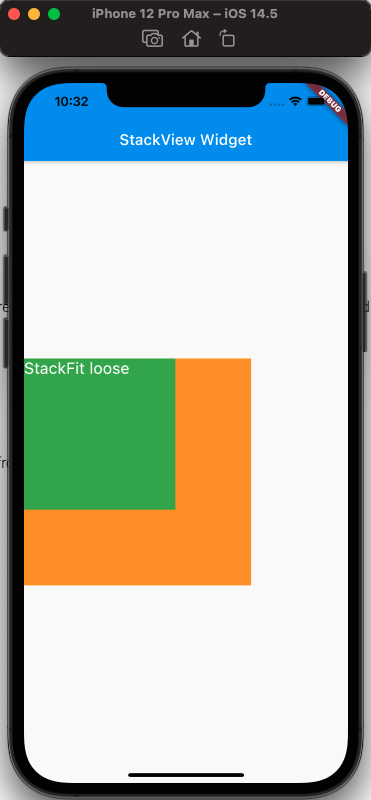
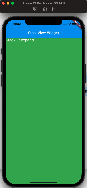
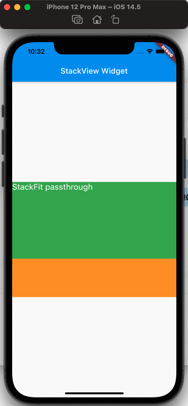
从上面可以看出,StackFit为passthrough属性时,使用了Row的Expand的布局;StackFit为loose时,使用的是子视图的布局;StackFit为expand时,使用的是Stack的布局。
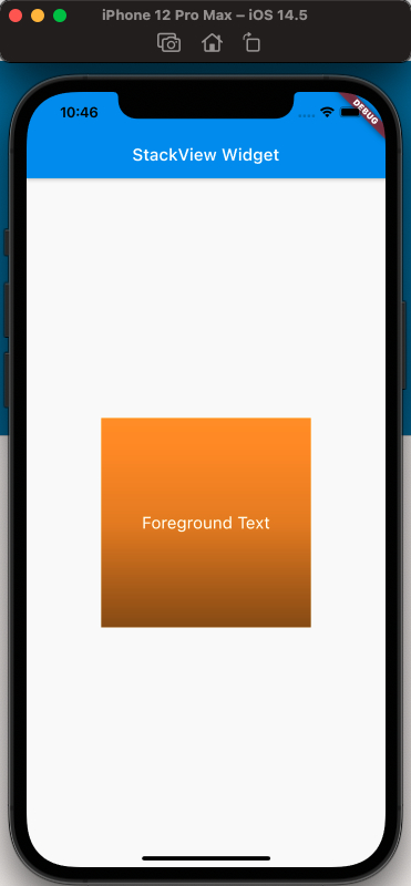
使用Stack实现渐变背景的效果
代码如下:
1
2
3
4
5
6
7
8
9
10
11
12
13
14
15
16
17
18
19
20
21
22
23
24
25
26
27
28
29
30
31
32
33
34
35
36
37
38
39
40
41
42
43
44
45
46
47
|
class MyApp extends StatelessWidget {
  @override
  Widget build(BuildContext context) {
    var stack = SizedBox(
      width: 250,
      height: 250,
      child: Stack(
        children: [
          Container(
            width: 250,
            height: 250,
            color: Colors.orange,
          ),
          Container(
              padding: const EdgeInsets.all(5.0),
              alignment: Alignment.center,
              decoration: BoxDecoration(
                  gradient: LinearGradient(
                colors: [
                  Colors.black.withAlpha(0),
                  Colors.black12,
                  Colors.black45,
                ],
                begin: Alignment.topCenter,
                end: Alignment.bottomCenter,
              )),
              child: const Text('Foreground Text',
                  style: TextStyle(color: Colors.white, fontSize: 20.0))),
        ],
      ),
    );

    return MaterialApp(
      title: 'StackView Widget',
      home: Scaffold(
        appBar: new AppBar(
          title: new Text('StackView Widget'),
        ),
        body: Center(
          child: stack,
        ),
      ),
    );
  }
}
|
效果如下:
参考
Stack Dev Doc
Positioned Dev Doc
StackFit Dev Doc
Flutter免费视频第三季-布局